Apr 21, 2011

Star Plot


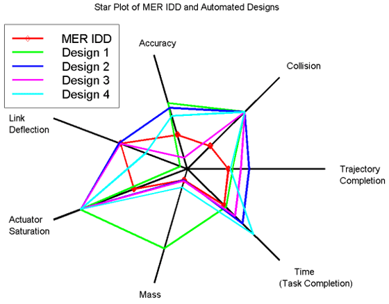
Star Plots illustrate multiple variables for location or other observation shown. The resulting lines around each primary point then allow for comparison against the star plots for other locations or observations.
http://start1.jpl.nasa.gov/caseStudies/autoTool.cfm

Stem and Leaf Plot

http://www.uow.edu.au/student/attributes/statlit/modules/module2/shapedist.html
A stem and leaf plot shows the shape and distribution of data. This image plots students grades in a class.

Box Plot

http://www.physics.csbsju.edu/stats/box2.html

A Box Plot, or box and whisker
Diagram, provides a simple
Graphical summary of a set of
Data.

It shows a measure of central
Location (the median), the average,
And measures of dispersion.

Box Plots are especially useful
When comparing two or more sets of 

Apr 20, 2011

Histogram

http://searchsoftwarequality.techtarget.com/definition/histogram

A histogram is a graphical display of tabulated frequencies, shown as bars. It shows what proportion of cases fall into each of several categories.

Parallel Coordinate Graph

http://vis.lbl.gov/Events/SC07/Drosophila/


Multivariate relations are obtained through the use of Parallel Coordinate Graphs. Specific properties of the relationship correspond to the geometrical properties of the graph.

Triangular Plot


A Triangular Plot is a graph of 3 variables. It is most often used in geologic studies to show the relative compositions of soils and rocks, but it can be more generally applied to any system of three variables.

http://www.dplot.com/triangle-plot.htm

A Triangular Plot is a graph of 3 variables. It is most often used in geologic studies to show the relative compositions of soils and rocks, but it can be more generally applied to any system of three variables.

Wind Rose


http://support.sas.com/documentation/cdl/en/graphref/63022/HTML/default/viewer.htm#a003117074.html

The windrose chart is named for charts of wind speed and direction. Windrose charts are a type of histogram which are useful when the extreme values of the histogram's midpoint variable are related. Typical applications include histograms involving direction, clock time, or other cyclical values

Climograph

http://www.uwsp.edu/geo/faculty/ritter/glossary/a_d/climograph.html


A climograph is a graphical depiction of the monthly precipitation and temperature conditions for a selected place. Precipitation is shown by the bar graph. A line graph depicts temperature.

Population Pyramid


http://www.thefullwiki.org/Demographics_of_the_Bahamas
Population Pyramids are graphs that show the distribution of population by age and sex.

This Population Pyramid illustrates the population distribution of the Bahamas.

Apr 17, 2011

Scatterplot


Scatter plots usually consist of a large body of data. The closer the data points to making a straight line when plotted, the higher the correlation between the two variables and the stronger their relationship. Scatterplots should be constructed when the relationship between two variables is of interest.

http://cnx.org/content/m10949/latest
This scatterplot is interesting, as it plots the age of husbands versus the age of their wives. It shows that ages among husband and wife have a high correlation.

Index Value Plot

An index is defined as a statistical indicator/number derived from a formula, which is used to characterize a set of data.
http://www.skepticalscience.com/What-causes-short-term-changes-in-ocean-heat.html

An index value plot is a type of visualization map that is plotted on a line graph.

Apr 15, 2011

Lorenz Curve

http://www.answers.com/topic/lorenz-curve

According to answers.com, A Lorenz curve is a graph for showing the concentration of ownership of economic quantities such as wealth and income; it is formed by plotting the cumulative distribution of the amount of the variable concerned against the cumulative frequency distribution of the individuals possessing the amount

Bilateral Graph


Bilateral graphs depict increases and decreases on either side of a zero line. They are used to display data of both positive and negative values
http://www.rba.gov.au/publications/bulletin/2008/feb/1.html

Nominal Choropleth Map

http://politicalmaps.org/

A Nominal Choropleth Map is a choropleth map that does not use a scale of numbers as its differentiating criteria. In these maps, an assortment of colors can be used, as the intensity of the color is not meant to indicate an intensity of data. In this example, each state is color-coded based upon its political party leanings.

Apr 10, 2011

Unstandardized Choropleth Map


Unstandardized Choropleth Maps do not aerially average data. The data is represented as a total value. In the map below, the unstandardized Choropleth map displays the number of water withdrawals by state across the US.
http://pubs.usgs.gov/fs/2005/3051/

Standardized Choropleth Map


http://www.geovista.psu.edu/grants/nci-esda/research.html


The data shows in standardized choropleth maps is considered to be standardized or normalized, which allows for comparison of distribution among different areas.

Univariate Chloropleth Maps


Univariate Choropleth maps use basic choropleth mapping techniques to illustrate the distribution of one single variable through shades of color or patterns. 

http://www.geovista.psu.edu/grants/nci-esda/software.html

Bivariate Choropleth Map

http://www.personal.psu.edu/acr181/election.html


A bivariate choropleth map displays two variables on a single map by combining two different sets of graphic symbols or colors. It is a variation of simple choropleth maps that portrays two separate phenomena simultaneously while accurately and graphically illustrating the relationship between the two distributed variables. 

Apr 7, 2011

Unclassed Choropleth Map


http://www.geog.ucsb.edu

An unclassed choropleth pap does not provide a scale or set number of classes into which states are categorized. There could be as many colors as there are states. The intensity of the color in this map shows the intensity of data. The darker states in this map have a higher population density.

Classed Choropleth Map


This classed choropleth map shows the relationship of males to females according to the 2000 census data. The classes are darker as the percentage of males to females is larger.
http://www.ilstu.edu/~jrcarter/Geo204/Choro/

Apr 5, 2011

Range Graded Proportional Circle Map


This is a simple image of a range graded proportional circle map. The areas of the circles correspond to the data set the map is showing. The size of the circles has a direct relationship to the data, which is not grouped.

http://instruct.uwo.ca/geog/242/lab11.htm

Digital Elevation Model

http://www.satimagingcorp.com/gallery/dem-sahara-tunisia-lg.html
A DEM is a digital map that shows terrain elevations for ground positions at regularly spaced horizontal intervals. They are often used to generate three-dimensional images, with our without color, that show the relief of the location.

Digital Line Graph

Digital Line Graphs illustrate data such as topography, hydrography, boundaries, roads, utility lines, etc. with images stored as lines, points and areas.
http://www.uwsp.edu/geo/projects/geoweb/participants/dutch/geolwisc/geostops/DePere.HTM

Digital Raster Graphic

http://www.tceq.texas.gov/gis/drg.html

This map is an example of a DRG (digital raster graphic). A DRG is a scanned image of a United States Geological Survey (USGS) topographic map, which is georeferenced to the surface of the earth and fit to the Universal Transverse Mercator projection.

Apr 3, 2011

Cartographic Animation


Cartographers are now able to animate maps to better illustrate a concept of geographic progression. The example of cartographic animation that I used shows the precipitation rate of the global water balance.


Isohyet

An isohyet map is a contour map that illustratAn isohyet map is a contour map that illustrates the third variable of rainfall using contour.

http://www.scoop.co.nz/stories/AK0808/S00090.htm
This map is showing the month’s rainfall in 100mm bands

Isotachs

http://wxmaps.org/pix/avnmr.00hr.html

An isotach is a line of equal wind speed and the wind patterns are portrayed on a map. This map shows isotach patterns across the continental US.

Isobars

On a weather map an isobar is a line drawn on a map connecting points of equal barometric pressure.


http://www.newmediastudio.org/DataDiscovery/Hurr_ED_Center/Hurr_Structure_Energetics/Closed_Isobars/Closed_Isobars.html

LIDAR

http://www.loc.gov/exhibits/911/images/lg-map-lidar1.jpg caption

LIDAR is a laser-based imaging system that displays, high-density elevation data. This LIDAR image was from September 15, 2001 after 9/11. It shows a 3-D model of the elevation of New York City in relation to the destruction from the attack.